
Menu
using GLMakie

fig = Figure()

menu = Menu(fig, options = ["viridis", "heat", "blues"], default = "blues")

funcs = [sqrt, x->x^2, sin, cos]

menu2 = Menu(fig,
    options = zip(["Square Root", "Square", "Sine", "Cosine"], funcs),
    default = "Square")

fig[1, 1] = vgrid!(
    Label(fig, "Colormap", width = nothing),
    menu,
    Label(fig, "Function", width = nothing),
    menu2;
    tellheight = false, width = 200)

ax = Axis(fig[1, 2])

func = Observable{Any}(funcs[1])

ys = lift(func) do f
    f.(0:0.3:10)
end
scat = scatter!(ax, ys, markersize = 10, color = ys)

cb = Colorbar(fig[1, 3], scat)

on(menu.selection) do s
    scat.colormap = s
end
notify(menu.selection)

on(menu2.selection) do s
    func[] = s
    autolimits!(ax)
end
notify(menu2.selection)

fig
Searching
While a menu is open, its selection box acts as a text box and typing filters the visible options. The filter attribute decides what counts as a match and defaults to a case-insensitive substring match on the option label. Set searchable = false for a plain dropdown without this behavior.
using GLMakie
fig = Figure(size = (300, 300))

menu = Menu(
    fig[1, 1], tellheight = false, valign = :top,
    options = ["Apple", "Apricot", "Banana", "Blackberry", "Cherry", "Grape"],
    search_placeholder = "type to filter..."
)

menu.is_open = true
events(fig).unicode_input[] = 'b'

fig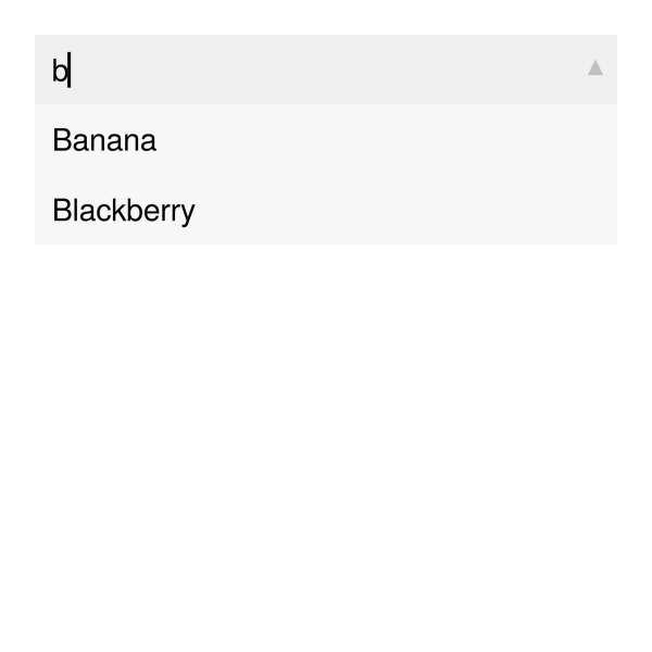
Menu direction
You can change the direction of the menu with direction = :up or direction = :down. By default, the direction is determined automatically to avoid cutoff at the figure boundaries.
using GLMakie

fig = Figure()

menu = Menu(fig[1, 1], options = ["A", "B", "C"])
menu2 = Menu(fig[3, 1], options = ["A", "B", "C"])

menu.is_open = true
menu2.is_open = true

fig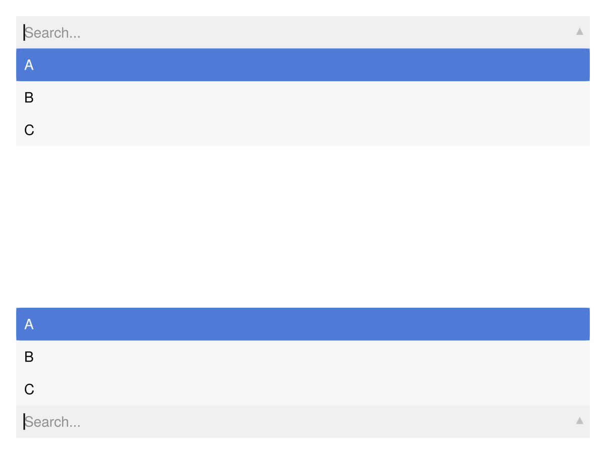
Attributes
alignmode
Defaults to Inside()
The alignment of the menu in its suggested bounding box.
cell_color_active
Defaults to COLOR_ACCENT[]
Cell color when active
cell_color_hover
Defaults to COLOR_ACCENT_DIMMED[]
Cell color when hovered
cell_color_inactive_even
Defaults to RGBf(0.97, 0.97, 0.97)
Cell color when inactive even
cell_color_inactive_odd
Defaults to RGBf(0.97, 0.97, 0.97)
Cell color when inactive odd
direction
Defaults to automatic
The opening direction of the menu (:up or :down)
dropdown_arrow_color
Defaults to (:black, 0.2)
Color of the dropdown arrow
dropdown_arrow_size
Defaults to 10
Size of the dropdown arrow
filter
Defaults to (q, s)->begin occursin(lowercase(q), lowercase(s)) end
Predicate (query::String, label::String) -> Bool deciding whether an option matches the search. Used only when searchable = true.
fontsize
Defaults to @inherit :fontsize 16.0f0
Font size of the cell texts
halign
Defaults to :center
The horizontal alignment of the menu in its suggested bounding box.
height
Defaults to Auto()
The height setting of the menu.
i_selected
Defaults to 0
Index of selected item. Should not be set by the user.
is_open
Defaults to false
Is the menu showing the available options
options
Defaults to ["no options"]
The list of options selectable in the menu. This can be any iterable of a mixture of strings and containers with one string and one other value. If an entry is just a string, that string is both label and selection. If an entry is a container with one string and one other value, the string is the label and the other value is the selection.
prompt
Defaults to "Select..."
The default message prompting a selection when i == 0
scroll_speed
Defaults to 15.0
Speed of scrolling in large Menu lists.
search_placeholder
Defaults to "Search..."
Placeholder text for the search box when searchable = true.
searchable
Defaults to true
If true, the open menu's selection box acts as a text box that filters options by filter(query, label). Honored only at construction time.
selection
Defaults to nothing
Selected item value. This is the output observable that you should listen to to react to menu interaction. Should not be set by the user.
selection_cell_color_inactive
Defaults to RGBf(0.94, 0.94, 0.94)
Selection cell color when inactive
tellheight
Defaults to true
Controls if the parent layout can adjust to this element's height
tellwidth
Defaults to true
Controls if the parent layout can adjust to this element's width
textcolor
Defaults to :black
Color of entry texts
textcolor_active
Defaults to :white
Color of the text of the entry that is the current selection
textcolor_hover
Defaults to :black
Color of the text of the entry that is hovered
textpadding
Defaults to (8, 10, 8, 8)
Padding of entry texts
valign
Defaults to :center
The vertical alignment of the menu in its suggested bounding box.
width
Defaults to nothing
The width setting of the menu.