Textbox
The Textbox provides an editable text field with optional validation.
Editing
Drag to select; double-click for the word at the cursor; triple-click for the line.
Hold ⌘ (or Ctrl) while clicking to add an extra cursor. ⌘+double-click and ⌘+triple-click add a word or line selection.
Arrow keys move the caret; Shift extends the selection; ⌥ (Alt) moves by whole words.
⌥+Backspace / ⌘+Backspace delete the previous word / line; ⌥+Delete / ⌘+Delete are the forward equivalents.
⌘+A selects all. ⌘+C / ⌘+X / ⌘+V copy / cut / paste; paste is filtered through
restriction.⌘+D selects the next occurrence of the current selection; ⌘+Shift+D the previous one.
Enter submits (subject to
validator); Shift+Enter forces a newline; Escape defocuses.
Validation
The validator attribute is used with validate_textbox(string, validator) to determine if the current string is valid. It can be a Regex that needs to match the complete string, or a Function taking a String as input and returning a Bool. If the validator is a type T (for example Float64), validation will be tryparse(T, string). The textbox will not allow submitting the currently entered value if the validator doesn't pass.
using CairoMakie

f = Figure()

tb = Textbox(f[2, 1], placeholder = "Enter a frequency",
    validator = Float64, tellwidth = false)

frequency = Observable(1.0)

on(tb.stored_string) do s
    frequency[] = parse(Float64, s)
end

xs = 0:0.01:10
sinecurve = @lift(sin.($frequency .* xs))

lines(f[1, 1], xs, sinecurve)

f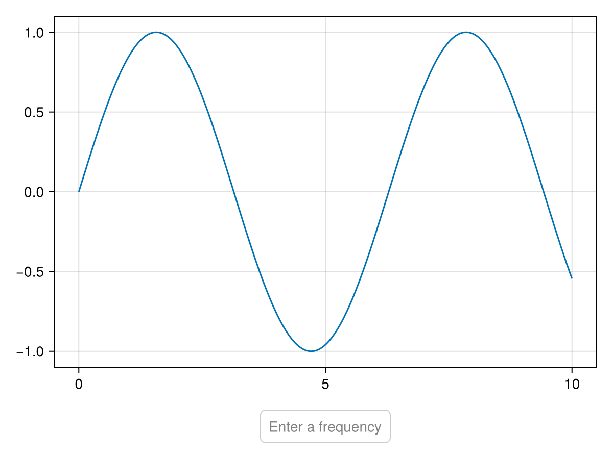
Attributes
alignmode
Defaults to Inside()
The alignment of the textbox in its suggested bounding box.
bordercolor
Defaults to RGBf(0.8, 0.8, 0.8)
Color of the box border.
bordercolor_focused
Defaults to COLOR_ACCENT[]
Color of the box border when focused.
bordercolor_focused_invalid
Defaults to RGBf(1, 0, 0)
Color of the box border when focused and invalid.
bordercolor_hover
Defaults to COLOR_ACCENT_DIMMED[]
Color of the box border when hovered.
borderwidth
Defaults to 1.0
Width of the box border.
boxcolor
Defaults to :transparent
Color of the box.
boxcolor_focused
Defaults to :transparent
Color of the box when focused.
boxcolor_focused_invalid
Defaults to RGBAf(1, 0, 0, 0.3)
Color of the box when focused.
boxcolor_hover
Defaults to :transparent
Color of the box when hovered.
cornerradius
Defaults to 5
Corner radius of text box.
cornersegments
Defaults to 20
Corner segments of one rounded corner.
cursorcolor
Defaults to COLOR_ACCENT[]
The color of the cursor.
defocus_on_submit
Defaults to true
Controls if the textbox is defocused when a string is submitted.
displayed_string
Defaults to nothing
The currently displayed string (for internal use).
focused
Defaults to false
If the textbox is focused and receives text input.
font
Defaults to :regular
Font family.
fontsize
Defaults to @inherit :fontsize 16.0f0
Text size.
halign
Defaults to :center
The horizontal alignment of the textbox in its suggested bounding box.
height
Defaults to Auto()
The height setting of the textbox.
placeholder
Defaults to "Click to edit..."
A placeholder text that is displayed when the saved string is nothing.
reset_on_defocus
Defaults to false
Controls if the displayed text is reset to the stored text when defocusing the textbox without submitting.
restriction
Defaults to nothing
Restricts the allowed unicode input via is_allowed(char, restriction).
stored_string
Defaults to nothing
The currently stored string.
tellheight
Defaults to true
Controls if the parent layout can adjust to this element's height.
tellwidth
Defaults to true
Controls if the parent layout can adjust to this element's width.
textcolor
Defaults to @inherit :textcolor :black
Text color.
textcolor_placeholder
Defaults to RGBf(0.5, 0.5, 0.5)
Text color for the placeholder.
textpadding
Defaults to (8, 8, 8, 8)
Padding of the text against the box.
validator
Defaults to str->begin true end
Validator that is called with validate_textbox(string, validator) to determine if the current string is valid. Can by default be a RegEx that needs to match the complete string, or a function taking a string as input and returning a Bool. If the validator is a type T (for example Float64), validation will be tryparse(T, string).
valign
Defaults to :center
The vertical alignment of the textbox in its suggested bounding box.
width
Defaults to Auto()
The width setting of the textbox.