Creating an Inset Plot
An inset plot (or inset axis) is a small plot embedded within a larger plot. It is commonly used to zoom in on a particular region of interest, show detailed views of a subset of the data or provide additional contextual information alongside the main plot. Inset plots are a valuable tool for enhancing data visualization, making them widely used in research, business and presentations. In this tutorial we will discuss how to create an inset plot in Makie.
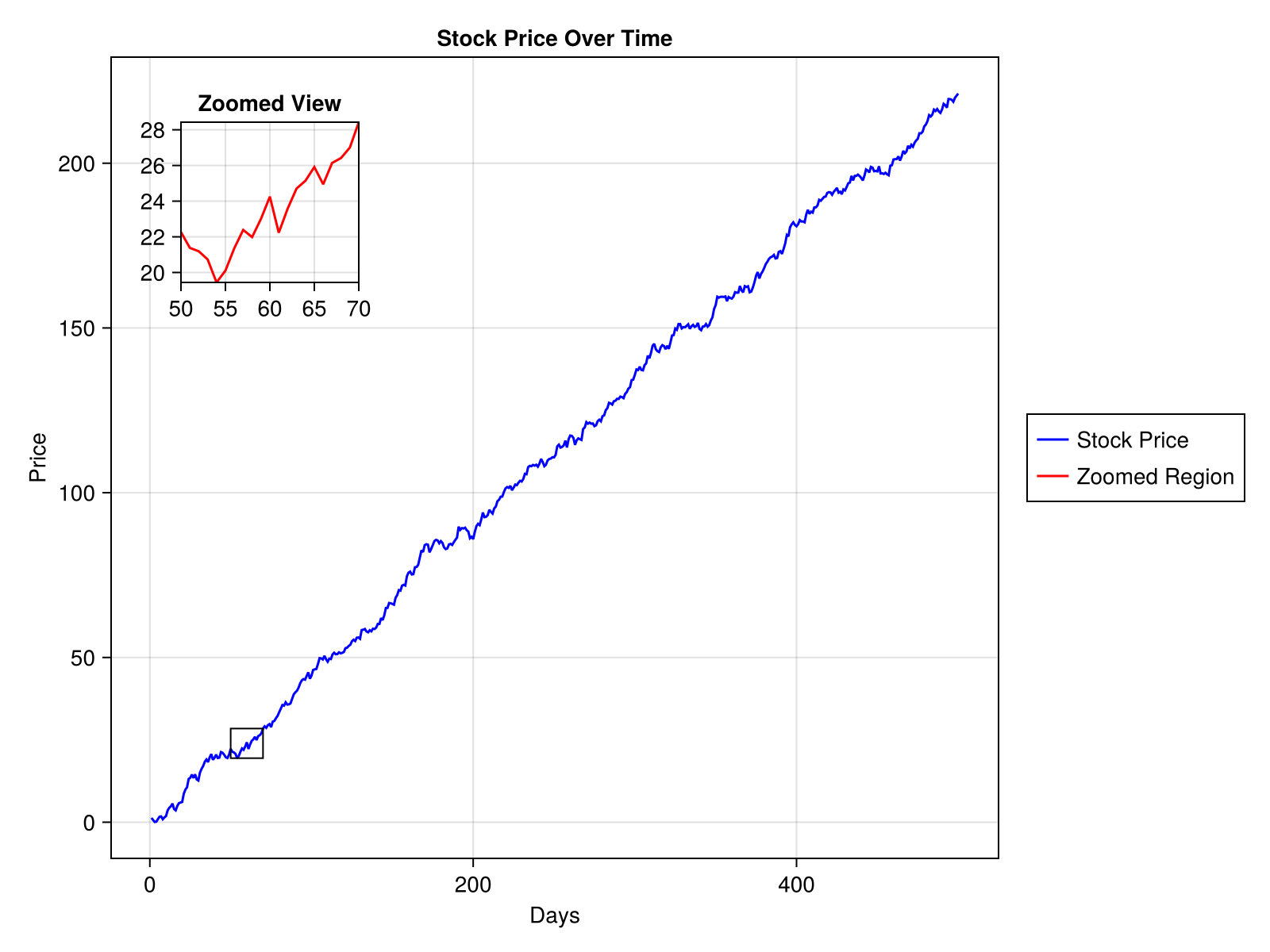
For example, in a plot showing stock prices over time, an inset can be used to display a magnified view of a specific time period to highlight price fluctuations more clearly.
Let's look at how to create this plot.
1. Load the Packages
Start by loading the CairoMakie backend package and Random package.
using CairoMakie
using Random
2. Prepare the Main Plot Data
Then we will generate the data required for the main plot (stock price data over a period of 500 days).
Random.seed!(123)
time = 1:500
stock_price = cumsum(randn(500) .+ 0.5)
500-element Vector{Float64}:
1.3082879284649667
0.6862154203507933
0.08157931802149743
0.16458668285656408
0.9521746634804198
1.6819933615322875
1.7602246971325948
0.9046340760313978
1.4740932171232914
1.856770412592478
⋮
217.60712784289905
216.83141499099918
219.47251374914612
219.4544230097809
219.23434002120027
218.64612150726398
219.84987983305626
220.4932057262938
221.14158109296993. Create the Main Plot
Use Figure() and Axis() to set up the main plot area and display the stock price data.
fig = Figure(size = (800, 600))

ax_main = Axis(fig[1, 1],
    title="Stock Price Over Time",
    xlabel="Days",
    ylabel="Price")

line_main = lines!(ax_main, time, stock_price, color=:blue)
fig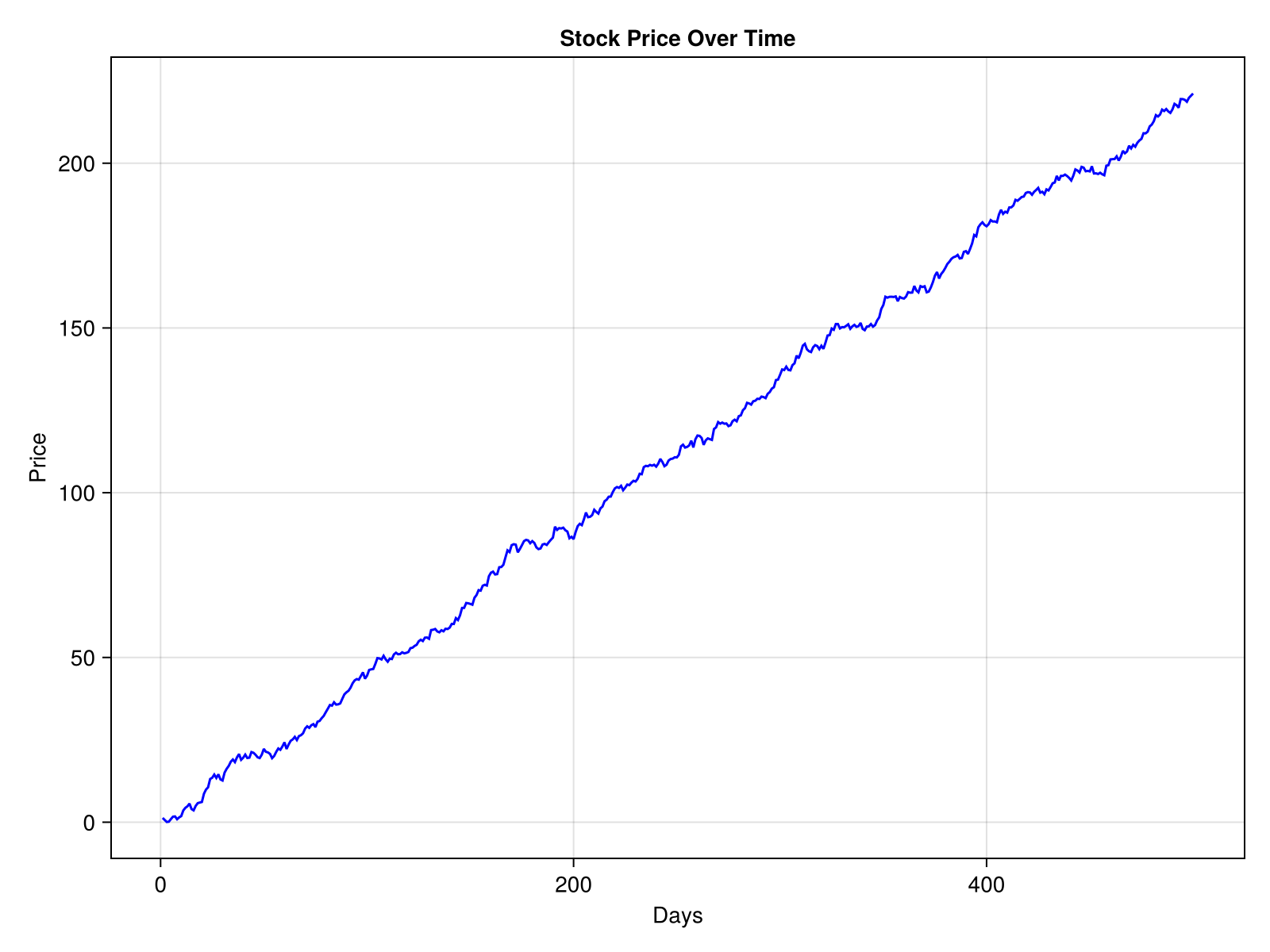
4. Add an Inset Axis
Now let's add an inset axis inside the main plot. We will use the same Axis() function, but adjust its size and position to embed it within the main plot.
ax_inset = Axis(fig[1, 1],
    width=Relative(0.2),
    height=Relative(0.2),
    halign=0.1,
    valign=0.9,
    title="Zoomed View")
Axis with 0 plots:To adjust the axis size, use width and height attributes. To adjust the axis position, use halign and valign attributes.
5. Plot Data in the Inset
We need to define the data for the inset. For instance, select the data between 50 to 70 days range and corresponding data for the price movement.
xlims!(ax_inset, 50, 70)
min_price, max_price = extrema(stock_price[50:70])
ylims!(ax_inset, min_price, max_price)
line_inset = lines!(ax_inset, time, stock_price, color=:red)
fig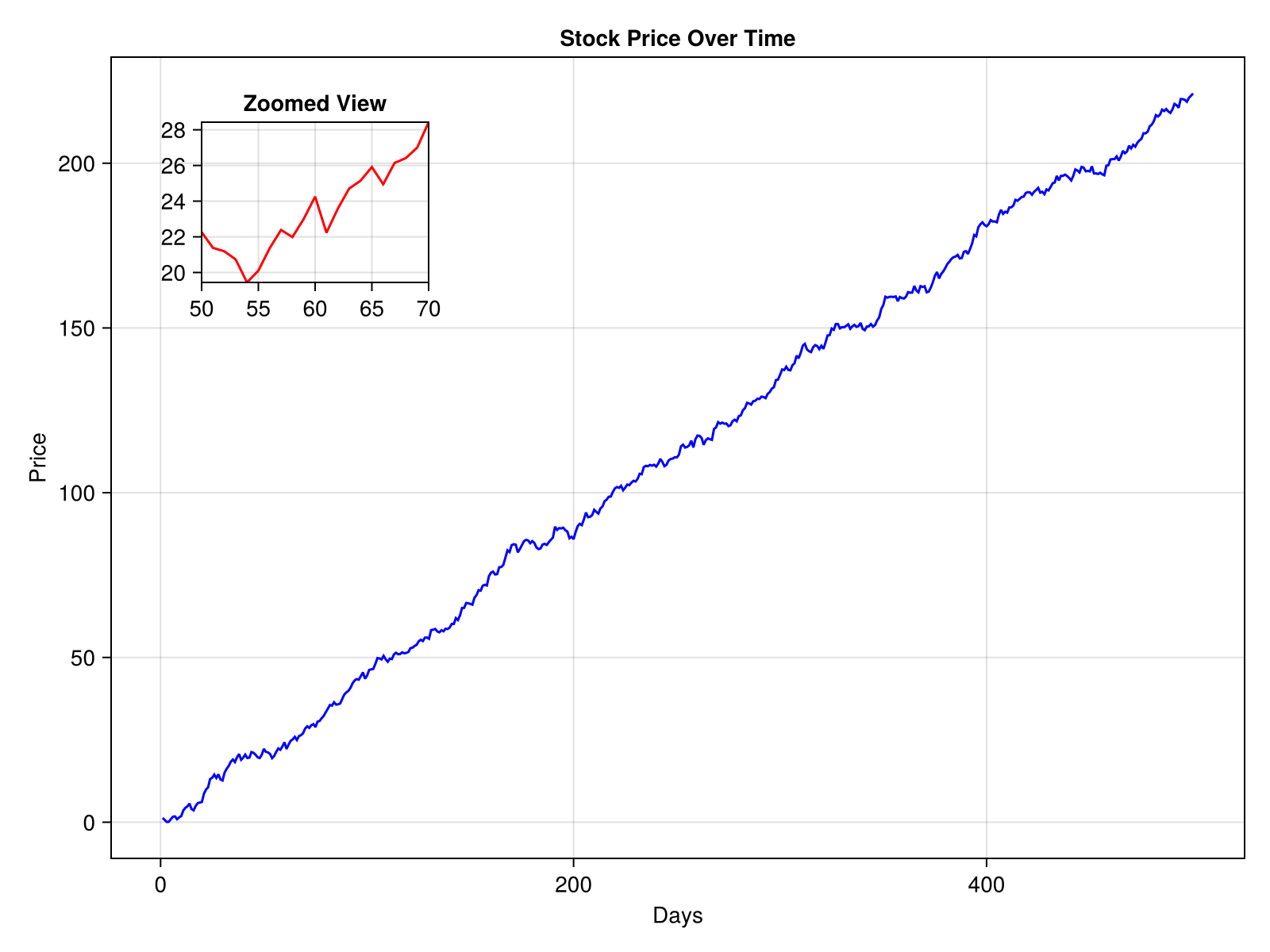
6. Control Drawing Order of Axes
It is important to make sure that the inset plot is rendered above the main plot. This is done by setting the z-value in translate! function to a positive value.
translate!(ax_inset.blockscene, 0, 0, 150)3-element Vec{3, Float64} with indices SOneTo(3):
0.0
0.0
150.07. Add a Legend
Let's add a legend to clarify what each line represents.
Legend(fig[1, 2], [line_main, line_inset], ["Stock Price", "Zoomed Region"])Legend()This adds a legend to the right of the figure, associating the blue line with the main plot and the red line with the inset plot.
8. Mark the Zoomed Section
Indicate the zoomed section of the main plot by drawing a border around the selected region.
border_rect = Rect2(50, min_price, 20, max_price - min_price)
lines!(ax_main, border_rect, color=:black, linewidth=1)
fig
Complete Code Example
Here’s the complete code snippet.
# Load the packages
using CairoMakie
using Random

# Generate dummy stock price data
Random.seed!(123)
time = 1:500
stock_price = cumsum(randn(500) .+ 0.5)

# Create a figure
fig = Figure(size=(800, 600))

# Main plot
ax_main = Axis(fig[1, 1],
    title="Stock Price Over Time",
    xlabel="Days",
    ylabel="Price")

line_main = lines!(ax_main, time, stock_price, color=:blue)

# Inset axis
ax_inset = Axis(fig[1, 1],
    width=Relative(0.2),
    height=Relative(0.2),
    halign=0.1,
    valign=0.9,
    title="Zoomed View")

# Set xlims for a selected time data range
xlims!(ax_inset, 50, 70)

# Calculate and set ylims dynamically for the selected time data range
min_price, max_price = extrema(stock_price[50:70])
ylims!(ax_inset, min_price, max_price)

# Plot the data in the inset axis
line_inset = lines!(ax_inset, time, stock_price, color=:red)

# Z-Ordering for rendering order
translate!(ax_inset.blockscene, 0, 0, 150)

# Legend
Legend(fig[1, 2], [line_main, line_inset], ["Stock Price", "Zoomed Region"])

# Mark the zoomed section (x, y, width, height)
border_rect = Rect2(50, min_price, 20, max_price - min_price)
lines!(ax_main, border_rect, color=:black, linewidth=1)

fig
Explanation of Key Elements and Related Information
1. Pixel Units vs. Relative Units for Inset Axis Size and Placement
Pixel Units: Specify exact size in pixels. Useful for precise sizes in fixed size layouts. Example: width = 200 sets the width to 200 pixels.
Relative Units: Define sizes as fractions of the parent container's size. Suitable for creating scalable layouts that adapt to different figure sizes. Example: width = Relative(0.2) sets the width to 20% of the parent figure's width.
halign and valign position the inset plot relative to the figure, with values ranging from 0 (left or bottom) to 1 (right or top).
2. translate! Function and Z-Ordering
z-order (depth) determines the rendering order of elements, with higher z-values appearing in front of lower ones. This is critical for ensuring that the inset axis is visible above the main plot and its elements. By explicitly setting the z-value using the translate! function, you can layer elements as needed. If the translate! function is omitted or the z-value is too low, the inset plot may render behind the main plot, making it invisible or partially obscured.
In Makie, the z-order for various elements in an axis typically ranges from -100 to +20; 0 for user plots (by default). For an inset axis to reliably appear in front of the main axis and user plots, it must have a z-value of at least +100. If you are adding custom z-values for the main axis, ensure the inset axis has a z-value greater than the highest z-value in the main axis plus 100.
main_axis_translate < inset_axis_translate - 100
The maximum z-value allowed is 10,000.
translate!(obj, 0, 0, some_positive_z_value)3. Marking the Section that the Inset Axis Shows
It is often helpful to visually indicate which part of the main plot corresponds to the inset axis. To achieve this we could draw a border around the selected region. We create a rectangle to mark the region of interest. Its limits are calculated using:
The x-axis range (e.g., 50 to 70) to mark the time period.
The y-axis range (
min_priceandmax_price) dynamically calculated from the data within this time range.
lines!() will take care of drawing the outline of the rectangle. Parameters like color and linewidth can be adjusted for visibility and style.
border_rect = Rect2(50, min_price, 20, max_price - min_price)
lines!(ax_main, border_rect, color=:black, linewidth=1)
Another approach to marking the selected region is to use the zoom_lines function from the MakieExtra.jl package. This function not only marks the region but also connects it to the inset axis with guiding lines, enhancing the visual connection between the main plot and the inset plot.