Creating complex layouts
In this tutorial, you will learn how to create a complex figure using Makie's layout tools.
Let's say that we want to create the following figure:
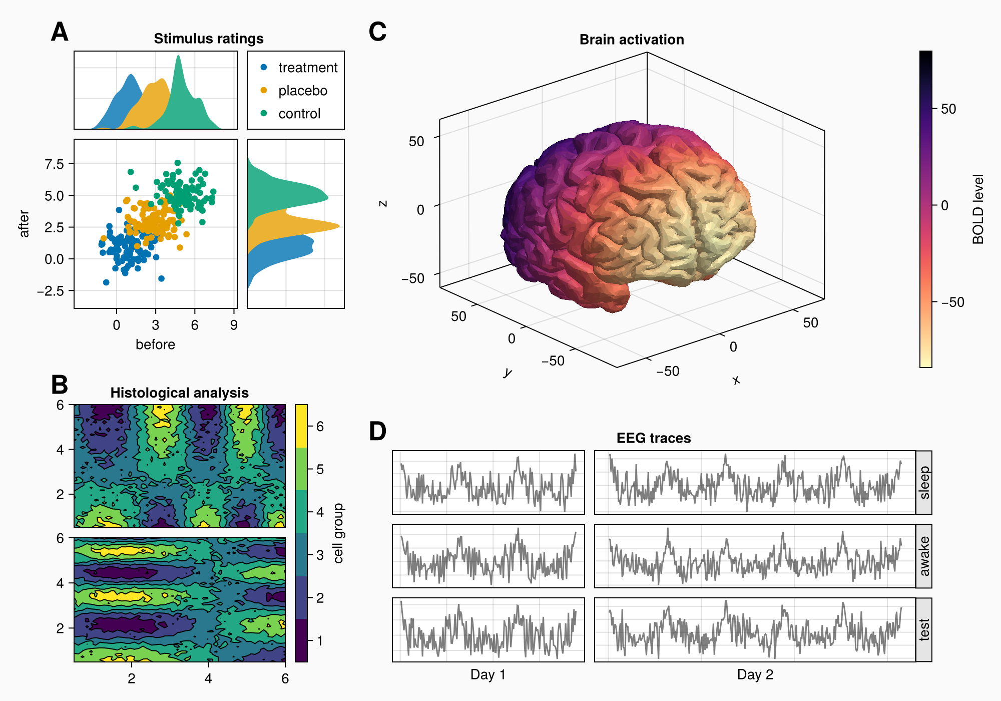
Here's the full code for reference:
using CairoMakie
using Makie.FileIO
CairoMakie.activate!() # hide

f = Figure(backgroundcolor = RGBf(0.98, 0.98, 0.98),
    size = (1000, 700))
ga = f[1, 1] = GridLayout()
gb = f[2, 1] = GridLayout()
gcd = f[1:2, 2] = GridLayout()
gc = gcd[1, 1] = GridLayout()
gd = gcd[2, 1] = GridLayout()
axtop = Axis(ga[1, 1])
axmain = Axis(ga[2, 1], xlabel = "before", ylabel = "after")
axright = Axis(ga[2, 2])

linkyaxes!(axmain, axright)
linkxaxes!(axmain, axtop)

labels = ["treatment", "placebo", "control"]
data = randn(3, 100, 2) .+ [1, 3, 5]

for (label, col) in zip(labels, eachslice(data, dims = 1))
    scatter!(axmain, col, label = label)
    density!(axtop, col[:, 1])
    density!(axright, col[:, 2], direction = :y)
end

ylims!(axtop, low = 0)
xlims!(axright, low = 0)

axmain.xticks = 0:3:9
axtop.xticks = 0:3:9

leg = Legend(ga[1, 2], axmain)

hidedecorations!(axtop, grid = false)
hidedecorations!(axright, grid = false)
leg.tellheight = true

colgap!(ga, 10)
rowgap!(ga, 10)

Label(ga[1, 1:2, Top()], "Stimulus ratings", valign = :bottom,
    font = :bold,
    padding = (0, 0, 5, 0))

xs = LinRange(0.5, 6, 50)
ys = LinRange(0.5, 6, 50)
data1 = [sin(x^1.5) * cos(y^0.5) for x in xs, y in ys] .+ 0.1 .* randn.()
data2 = [sin(x^0.8) * cos(y^1.5) for x in xs, y in ys] .+ 0.1 .* randn.()

ax1, hm = contourf(gb[1, 1], xs, ys, data1,
    levels = 6)
ax1.title = "Histological analysis"
contour!(ax1, xs, ys, data1, levels = 5, color = :black)
hidexdecorations!(ax1)

ax2, hm2 = contourf(gb[2, 1], xs, ys, data2,
    levels = 6)
contour!(ax2, xs, ys, data2, levels = 5, color = :black)

cb = Colorbar(gb[1:2, 2], hm, label = "cell group")
low, high = extrema(data1)
edges = range(low, high, length = 7)
centers = (edges[1:6] .+ edges[2:7]) .* 0.5
cb.ticks = (centers, string.(1:6))

cb.alignmode = Mixed(right = 0)

colgap!(gb, 10)
rowgap!(gb, 10)

brain = load(assetpath("brain.stl"))

ax3d = Axis3(gc[1, 1], title = "Brain activation")
m = mesh!(
    ax3d,
    brain,
    color = [tri[1][2] for tri in brain for i in 1:3],
    colormap = Reverse(:magma),
)
Colorbar(gc[1, 2], m, label = "BOLD level")

axs = [Axis(gd[row, col]) for row in 1:3, col in 1:2]
hidedecorations!.(axs, grid = false, label = false)

for row in 1:3, col in 1:2
    xrange = col == 1 ? (0:0.1:6pi) : (0:0.1:10pi)

    eeg = [sum(sin(pi * rand() + k * x) / k for k in 1:10)
        for x in xrange] .+ 0.1 .* randn.()

    lines!(axs[row, col], eeg, color = (:black, 0.5))
end

axs[3, 1].xlabel = "Day 1"
axs[3, 2].xlabel = "Day 2"

Label(gd[1, :, Top()], "EEG traces", valign = :bottom,
    font = :bold,
    padding = (0, 0, 5, 0))

rowgap!(gd, 10)
colgap!(gd, 10)

for (i, label) in enumerate(["sleep", "awake", "test"])
    Box(gd[i, 3], color = :gray90)
    Label(gd[i, 3], label, rotation = pi/2, tellheight = false)
end

colgap!(gd, 2, 0)

n_day_1 = length(0:0.1:6pi)
n_day_2 = length(0:0.1:10pi)

colsize!(gd, 1, Auto(n_day_1))
colsize!(gd, 2, Auto(n_day_2))

for (label, layout) in zip(["A", "B", "C", "D"], [ga, gb, gc, gd])
    Label(layout[1, 1, TopLeft()], label,
        fontsize = 26,
        font = :bold,
        padding = (0, 5, 5, 0),
        halign = :right)
end

colsize!(f.layout, 1, Auto(0.5))

rowsize!(gcd, 1, Auto(1.5))

f
How do we approach this task?
In the following sections, we'll go over the process step by step. We're not always going to use the shortest possible syntax, as the main goal is to get a better understanding of the logic and the available options.
Basic layout plan
When building figures, you always think in terms of rectangular boxes. We want to find the biggest boxes that enclose meaningful groups of content, and then we realize those boxes either using GridLayout or by placing content objects there.
If we look at our target figure, we can imagine one box around each of the labelled areas A, B, C and D. But A and C are not in one row, neither are B and D. This means that we don't use a 2x2 GridLayout, but have to be a little more creative.
We could say that A and B are in one column, and C and D are in one column. We can have different row heights for both groups by making one big nested GridLayout within the second column, in which we place C and D. This way the rows of column 2 are decoupled from column 1.
Ok, let's create the figure first with a gray backgroundcolor, and a predefined font:
using CairoMakie
using FileIO

f = Figure(backgroundcolor = RGBf(0.98, 0.98, 0.98),
    size = (1000, 700))
Setting up GridLayouts
Now, let's make the four nested GridLayouts that are going to hold the objects of A, B, C and D. There's also the layout that holds C and D together, so the rows are separate from A and B. We are not going to see anything yet as we have no visible content, but that will come soon.
Note
It's not strictly necessary to first create separate GridLayouts, then use them to place objects in the figure. You can also implicitly create nested grids using multiple indexing, for example like Axis(f[1, 2:3][4:5, 6]). This is further explained in GridPositions and GridSubpositions. But if you want to manipulate your nested grids afterwards, for example to change column sizes or row gaps, it's easier if you have them stored in variables already.
ga = f[1, 1] = GridLayout()
gb = f[2, 1] = GridLayout()
gcd = f[1:2, 2] = GridLayout()
gc = gcd[1, 1] = GridLayout()
gd = gcd[2, 1] = GridLayout()
Panel A
Now we can start placing objects into the figure. We start with A.
There are three axes and a legend. We can place the axes first, link them appropriately, and plot the first data into them.
axtop = Axis(ga[1, 1])
axmain = Axis(ga[2, 1], xlabel = "before", ylabel = "after")
axright = Axis(ga[2, 2])

linkyaxes!(axmain, axright)
linkxaxes!(axmain, axtop)

labels = ["treatment", "placebo", "control"]
data = randn(3, 100, 2) .+ [1, 3, 5]

for (label, col) in zip(labels, eachslice(data, dims = 1))
    scatter!(axmain, col, label = label)
    density!(axtop, col[:, 1])
    density!(axright, col[:, 2], direction = :y)
end

f
There's a small gap between the density plots and their axes, which we can remove by fixing one side of the limits.
ylims!(axtop, low = 0)
xlims!(axright, low = 0)

f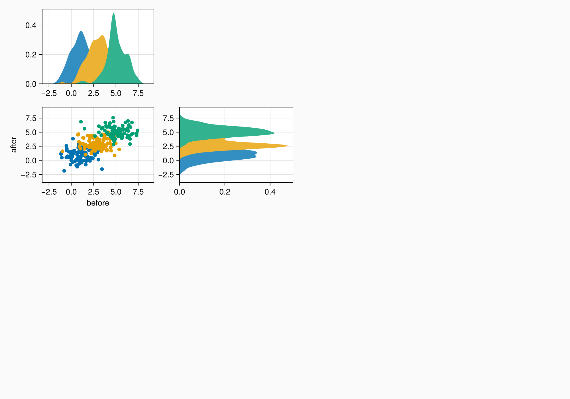
We can also choose different x ticks with whole numbers.
axmain.xticks = 0:3:9
axtop.xticks = 0:3:9

f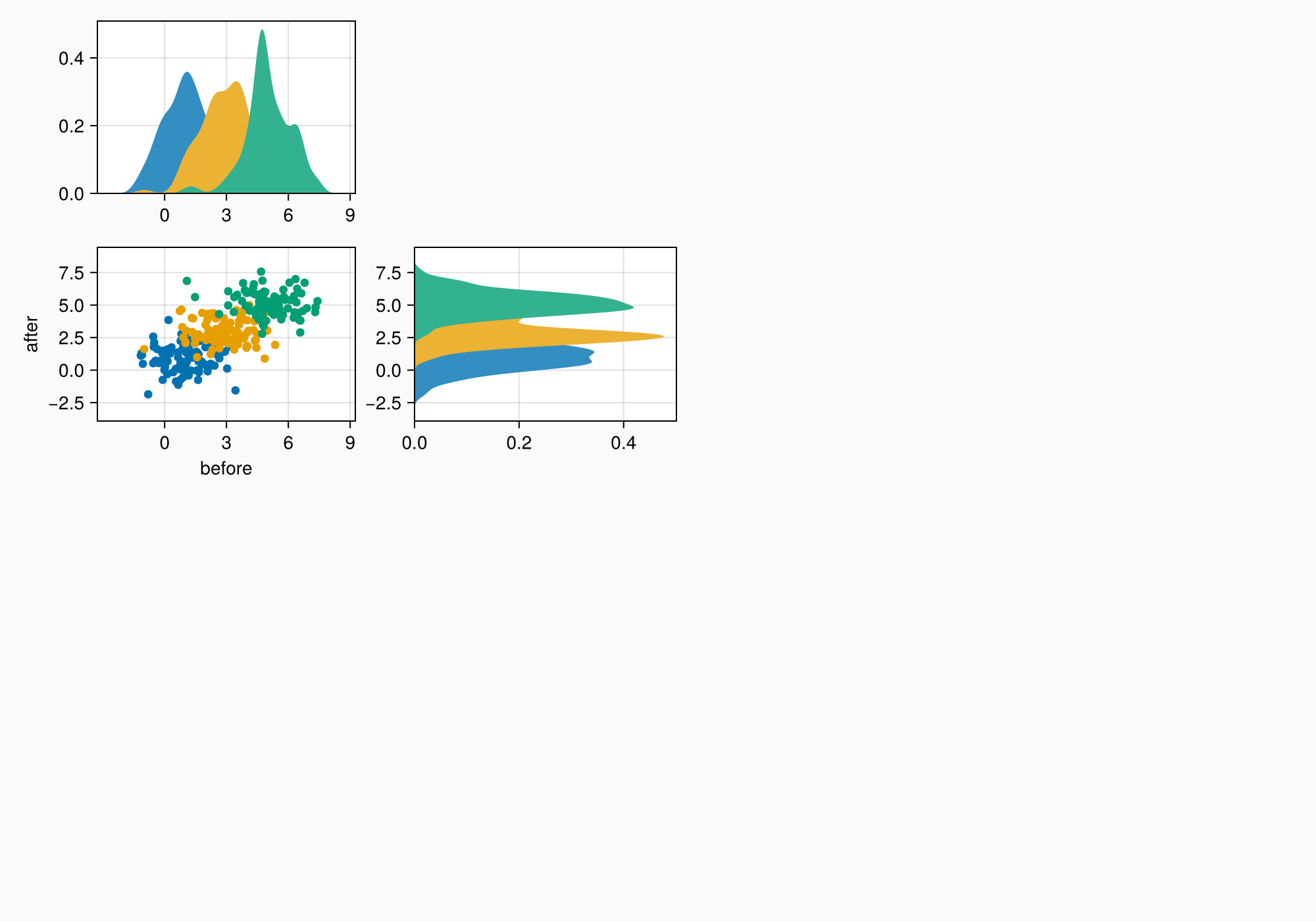
Legend
We have set the label attribute in the scatter call so it's easier to construct the legend. We can just pass axmain as the second argument to Legend.
leg = Legend(ga[1, 2], axmain)

f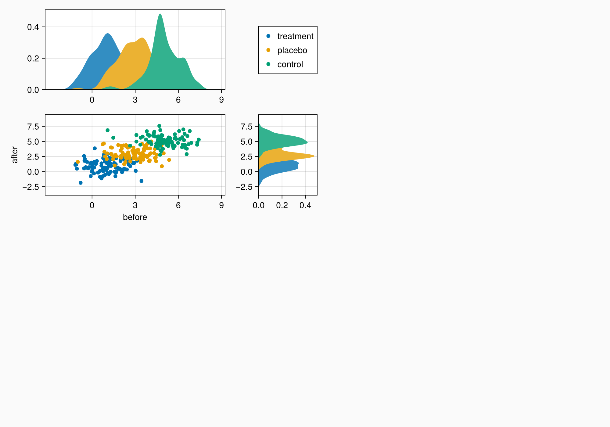
Legend Tweaks
There are a couple things we want to change. There are unnecessary decorations for the side axes, which we are going to hide.
Also, the top axis does not have the same height as the legend. That's because a legend is usually used on the right of an Axis and is therefore preset with tellheight = false. We set this attribute to true so the row in which the legend sits can contract to its known size.
hidedecorations!(axtop, grid = false)
hidedecorations!(axright, grid = false)
leg.tellheight = true

f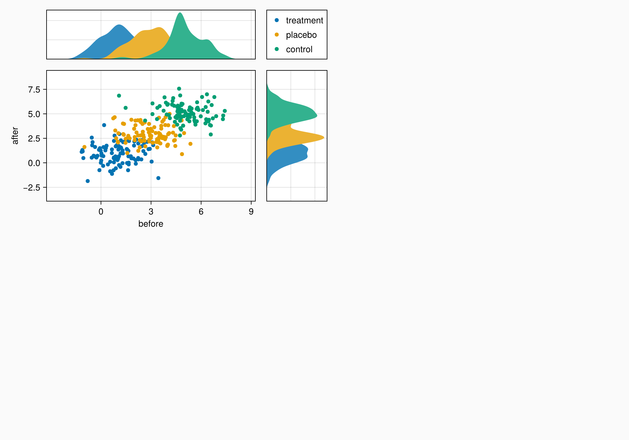
The axes are still a bit too far apart, so we reduce column and row gaps.
colgap!(ga, 10)
rowgap!(ga, 10)

f
We can make a title by placing a label across the top two elements.
Label(ga[1, 1:2, Top()], "Stimulus ratings", valign = :bottom,
    font = :bold,
    padding = (0, 0, 5, 0))

f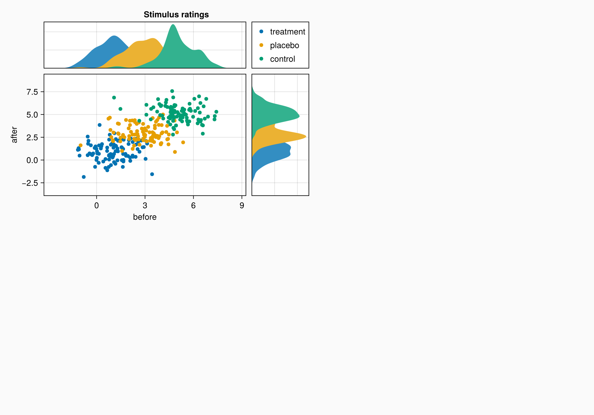
Panel B
Let's move to B. We have two axes stacked on top of each other, and a colorbar alongside them. This time, we create the axes by just plotting into the right GridLayout slots. This can be more convenient than creating an Axis first.
xs = LinRange(0.5, 6, 50)
ys = LinRange(0.5, 6, 50)
data1 = [sin(x^1.5) * cos(y^0.5) for x in xs, y in ys] .+ 0.1 .* randn.()
data2 = [sin(x^0.8) * cos(y^1.5) for x in xs, y in ys] .+ 0.1 .* randn.()

ax1, hm = contourf(gb[1, 1], xs, ys, data1,
    levels = 6)
ax1.title = "Histological analysis"
contour!(ax1, xs, ys, data1, levels = 5, color = :black)
hidexdecorations!(ax1)

ax2, hm2 = contourf(gb[2, 1], xs, ys, data2,
    levels = 6)
contour!(ax2, xs, ys, data2, levels = 5, color = :black)

f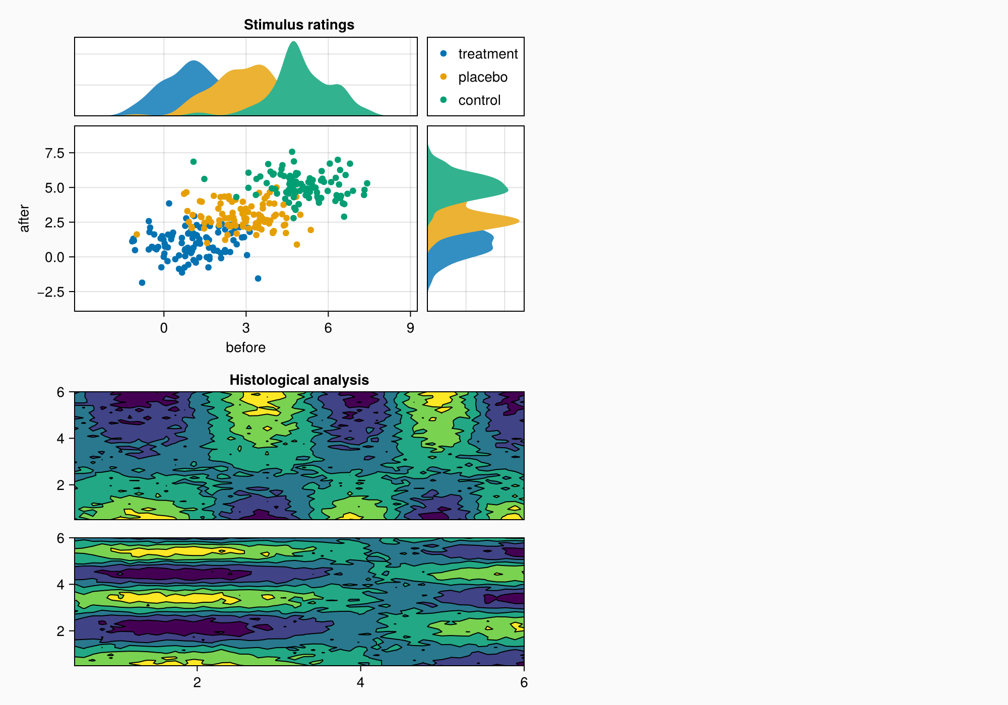
Colorbar
Now we need a colorbar. Because we haven't set specific edges for the two contour plots, just how many levels there are, we can make a colorbar using one of the contour plots and then label the bins in there from one to six.
cb = Colorbar(gb[1:2, 2], hm, label = "cell group")
low, high = extrema(data1)
edges = range(low, high, length = 7)
centers = (edges[1:6] .+ edges[2:7]) .* 0.5
cb.ticks = (centers, string.(1:6))

f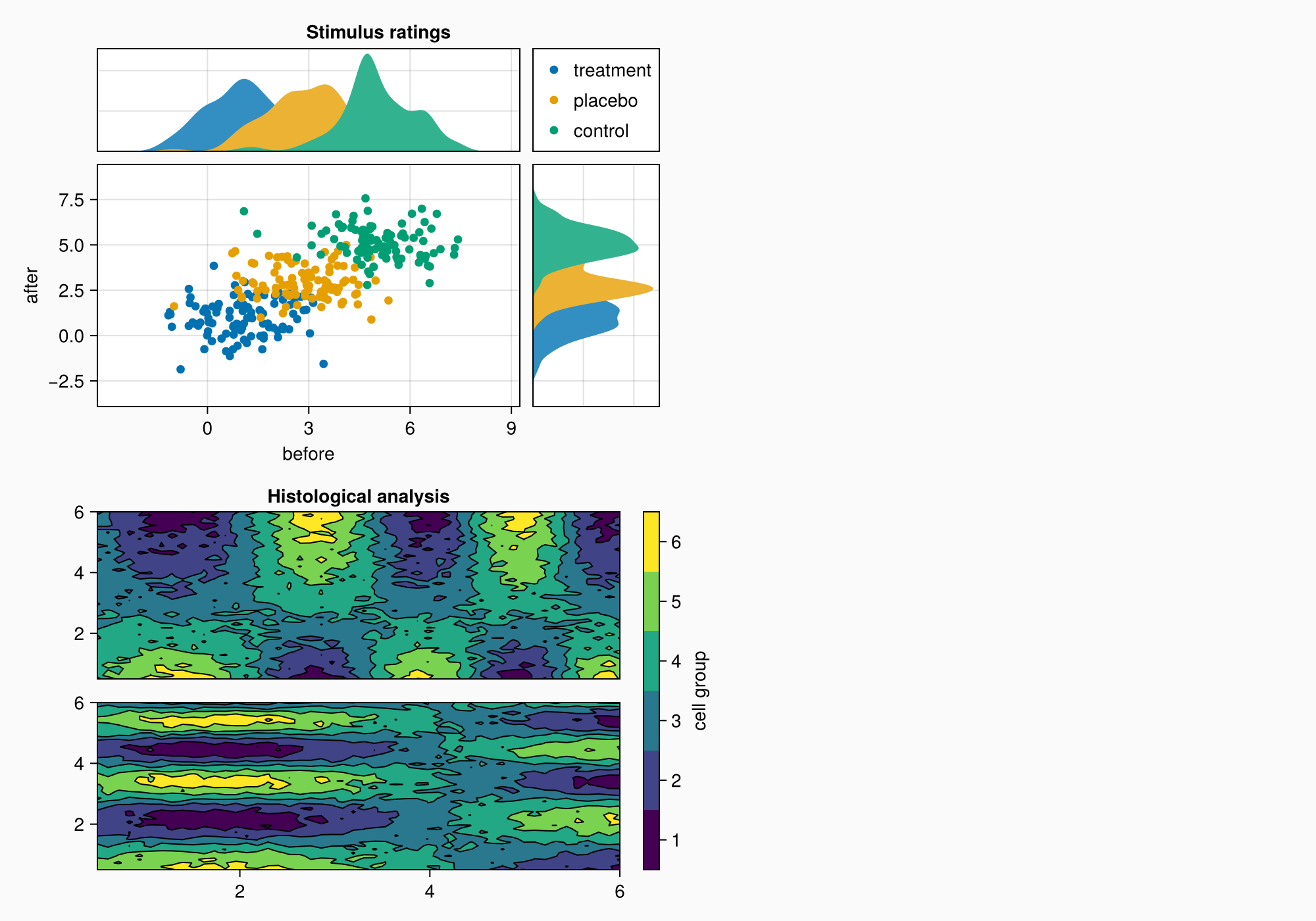
Mixed alignmode
The right edge of the colorbar is currently aligned with the right edge of the upper density plot. This can later cause a bit of a gap between the density plot and content on the right.
In order to improve this, we can pull the colorbar labels into its layout cell using the Mixed alignmode. The keyword right = 0 means that the right side of the colorbar should pull its protrusion content inward with an additional padding of 0.
cb.alignmode = Mixed(right = 0)

f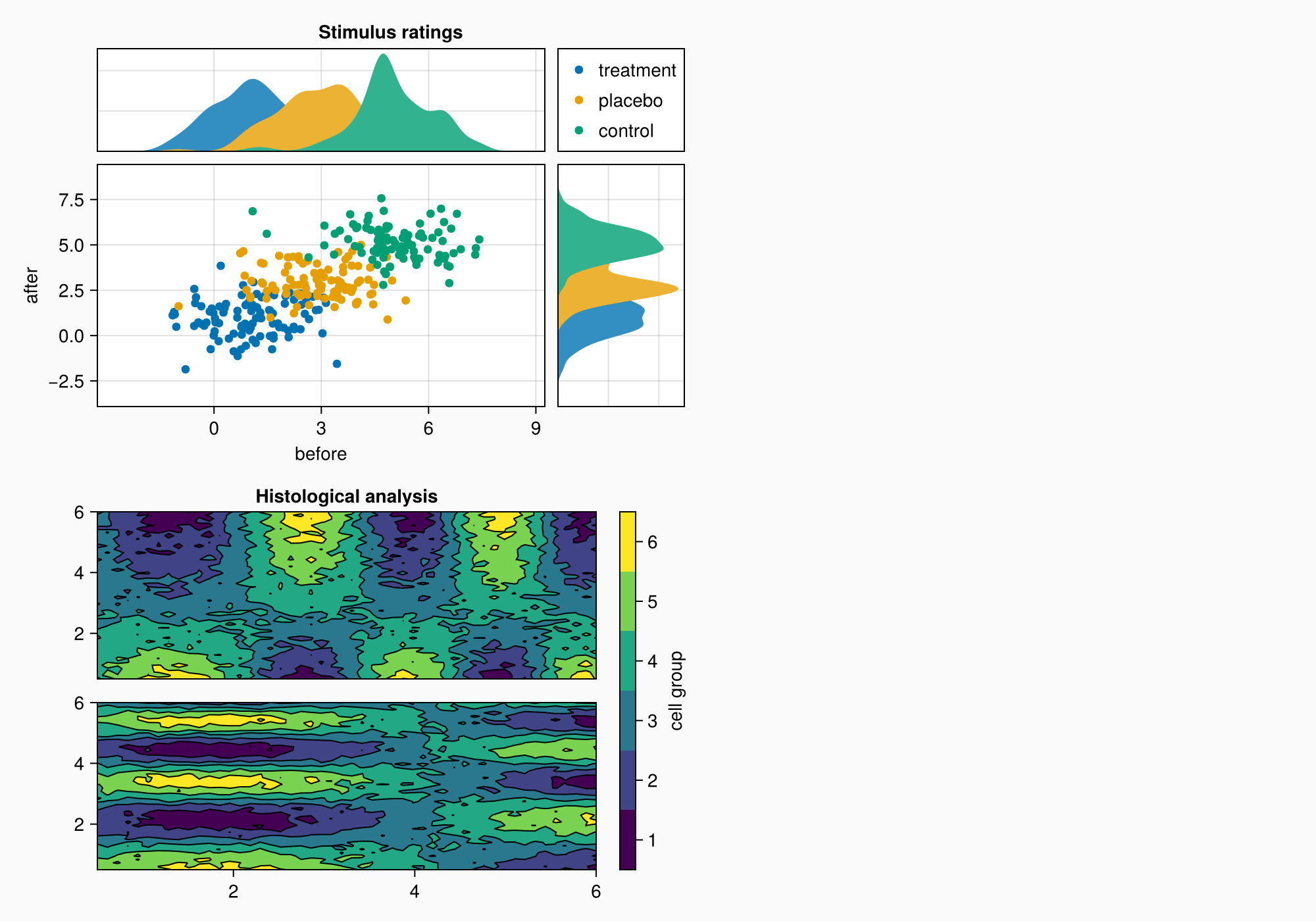
As in A, the axes are a bit too far apart.
colgap!(gb, 10)
rowgap!(gb, 10)

f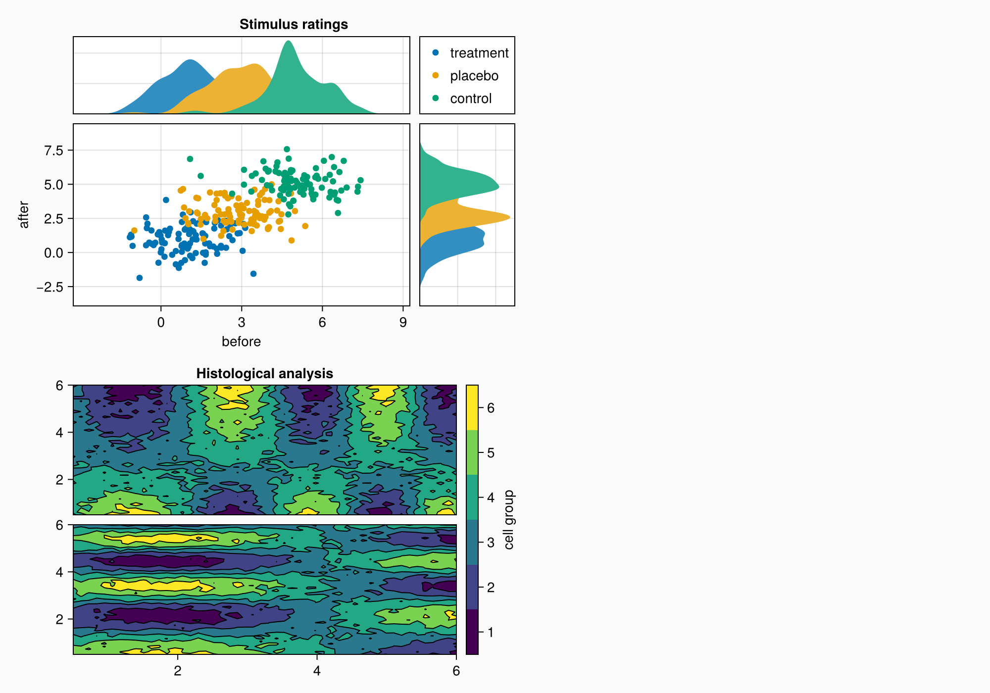
Panel C
Now, we move on to panel C. This is just an Axis3 with a colorbar on the side.
brain = load(assetpath("brain.stl"))

ax3d = Axis3(gc[1, 1], title = "Brain activation")
m = mesh!(
    ax3d,
    brain,
    color = [tri[1][2] for tri in brain for i in 1:3],
    colormap = Reverse(:magma),
)
Colorbar(gc[1, 2], m, label = "BOLD level")

f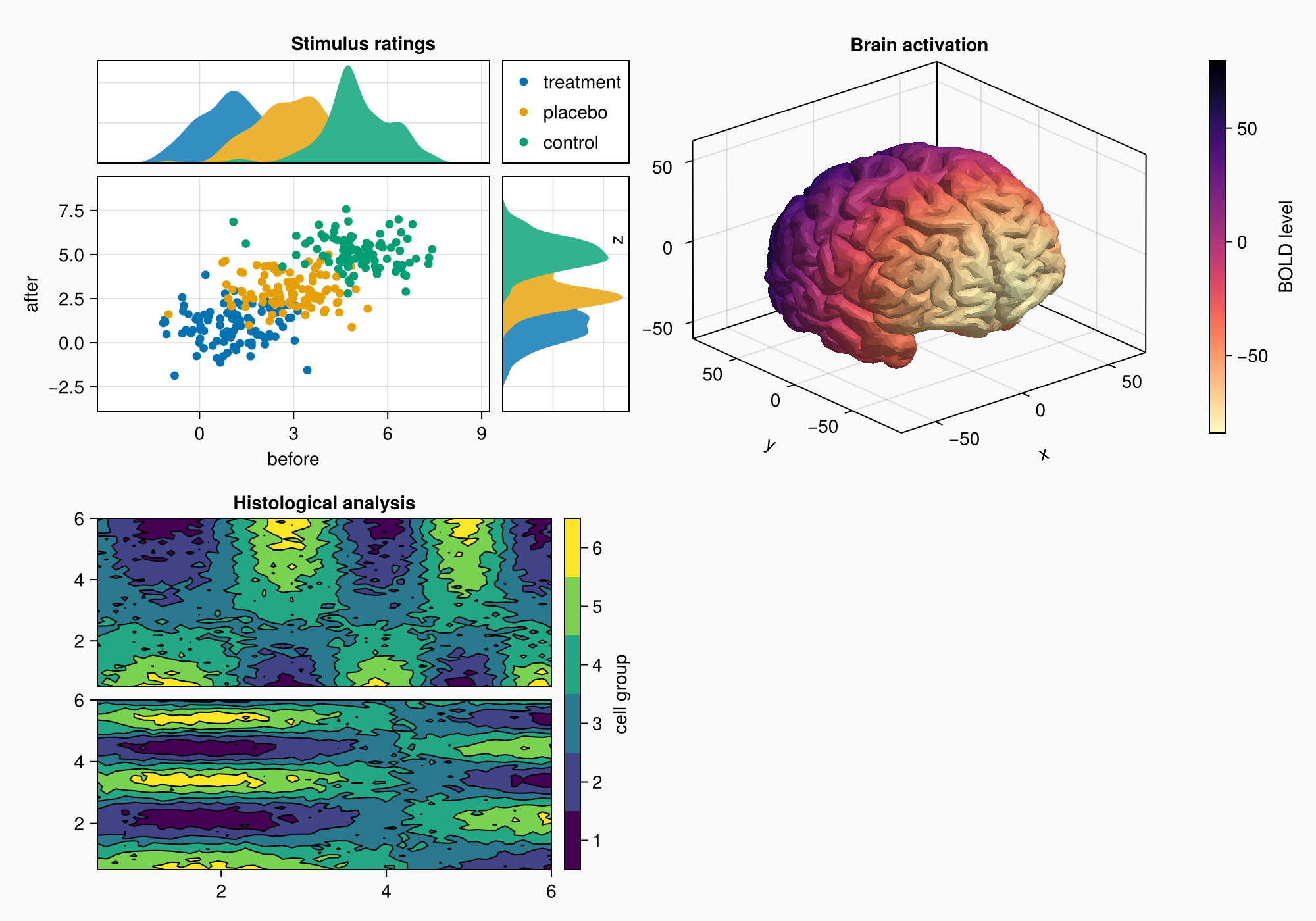
Note that the z label overlaps the plot to the left a little bit. Axis3 can't have automatic protrusions because the label positions change with the projection and the cell size of the axis, which is different from the 2D Axis.
You can set the attribute ax3.protrusions to a tuple of four values (left, right, bottom, top) but in this case we just continue plotting until we have all objects that we want, before we look if small tweaks like that are necessary.
Panel D
We move on to Panel D, which has a grid of 3x2 axes.
axs = [Axis(gd[row, col]) for row in 1:3, col in 1:2]
hidedecorations!.(axs, grid = false, label = false)

for row in 1:3, col in 1:2
    xrange = col == 1 ? (0:0.1:6pi) : (0:0.1:10pi)

    eeg = [sum(sin(pi * rand() + k * x) / k for k in 1:10)
        for x in xrange] .+ 0.1 .* randn.()

    lines!(axs[row, col], eeg, color = (:black, 0.5))
end

axs[3, 1].xlabel = "Day 1"
axs[3, 2].xlabel = "Day 2"

f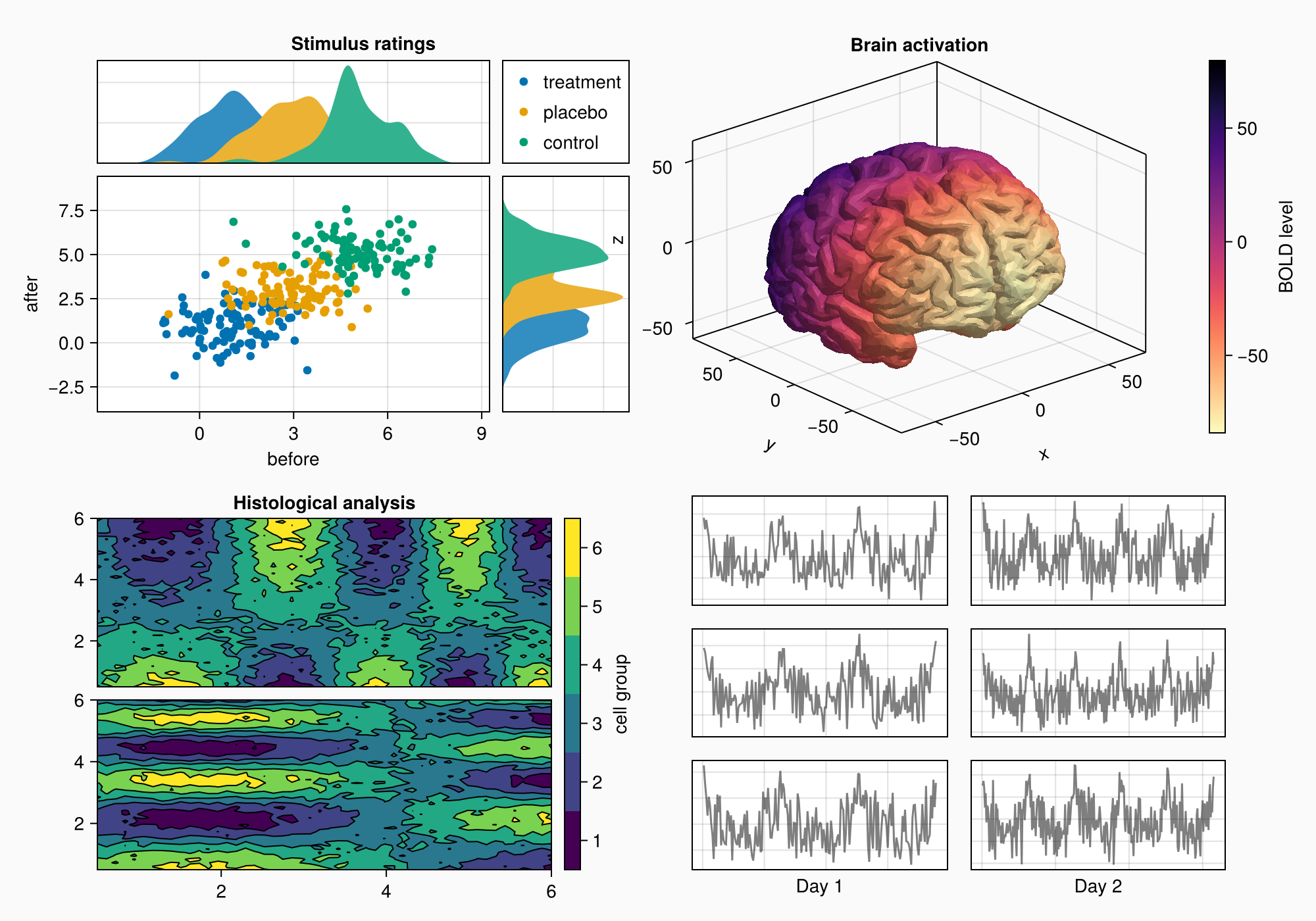
We can make a little title for the six axes by placing a Label in the top protrusion of row 1 and across both columns.
Label(gd[1, :, Top()], "EEG traces", valign = :bottom,
    font = :bold,
    padding = (0, 0, 5, 0))

f
Again, we bring the subplots closer together by reducing gap sizes.
rowgap!(gd, 10)
colgap!(gd, 10)

f
EEG labels
Now, we add three boxes on the side with labels in them. In this case, we just place them in another column to the right.
for (i, label) in enumerate(["sleep", "awake", "test"])
    Box(gd[i, 3], color = :gray90)
    Label(gd[i, 3], label, rotation = pi/2, tellheight = false)
end

f
The boxes are in the correct positions, but we still need to remove the column gap.
colgap!(gd, 2, 0)

f
Scaling axes relatively
The fake EEG data we have created has more datapoints on day 2 than day 1. We want to scale the axes so that they both have the same zoom level. We can do this by setting the column widths to Auto(x) where x is a number proportional to the number of data points of the axis. This way, both will have the same relative scaling.
n_day_1 = length(0:0.1:6pi)
n_day_2 = length(0:0.1:10pi)

colsize!(gd, 1, Auto(n_day_1))
colsize!(gd, 2, Auto(n_day_2))

f
Subplot labels
Now, we can add the subplot labels. We already have our four GridLayout objects that enclose each panel's content, so the easiest way is to create Labels in the top left protrusion of these layouts. That will leave all other alignments intact, because we're not creating any new columns or rows. The labels belong to the gaps between the layouts instead.
for (label, layout) in zip(["A", "B", "C", "D"], [ga, gb, gc, gd])
    Label(layout[1, 1, TopLeft()], label,
        fontsize = 26,
        font = :bold,
        padding = (0, 5, 5, 0),
        halign = :right)
end

f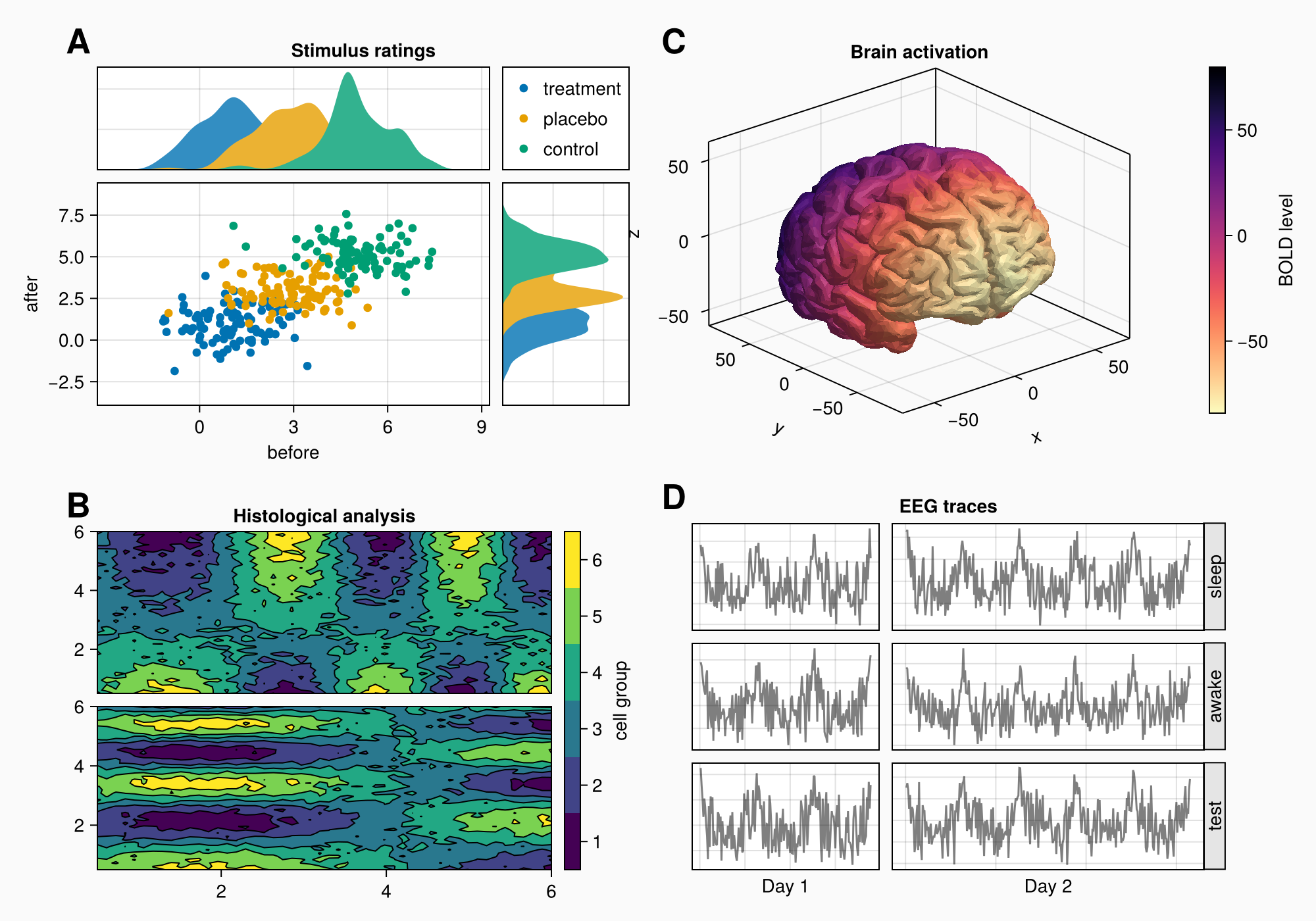
Final tweaks
This looks pretty good already, but the first column of the layout is a bit too wide. We can reduce the column width by setting it to Auto with a number smaller than 1, for example. This gives the column a smaller weight when distributing widths between all columns with Auto sizes.
You can also use Relative or Fixed but they are not as flexible if you add more things later, so I prefer using Auto.
colsize!(f.layout, 1, Auto(0.5))

f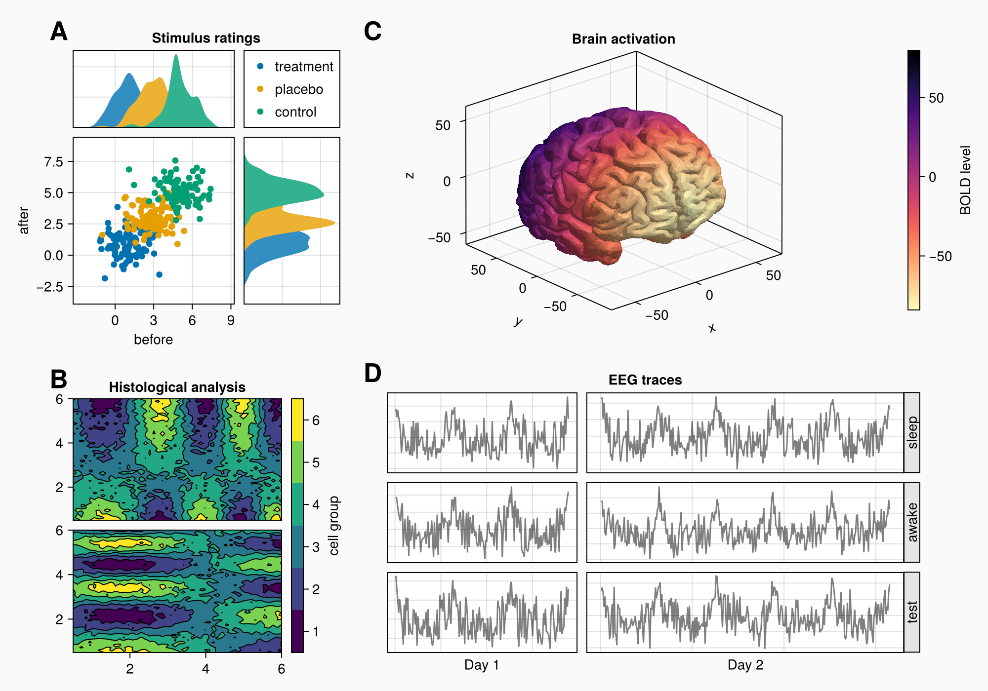
The EEG traces are currently as high as the brain axis, let's increase the size of the row with the panel C layout a bit so it has more space.
rowsize!(gcd, 1, Auto(1.5))

f