
Slider
A simple slider without a label. You can create a label using a Label object, for example. You need to specify a range that constrains the slider's possible values.
The currently selected value is in the attribute value. Don't change this value manually, but use the function set_close_to!(slider, value). This is necessary to ensure the value is actually present in the range attribute.
You can double-click the slider to reset it (approximately) to the value present in startvalue.
If you set the attribute snap = false, the slider will move continuously while dragging and only jump to the closest available value when releasing the mouse.
using GLMakie

fig = Figure()

ax = Axis(fig[1, 1])

sl_x = Slider(fig[2, 1], range = 0:0.01:10, startvalue = 3, update_while_dragging=false)
sl_y = Slider(fig[1, 2], range = 0:0.01:10, horizontal = false, startvalue = 6)

point = lift(sl_x.value, sl_y.value) do x, y
    Point2f(x, y)
end

scatter!(point, color = :red, markersize = 20)

limits!(ax, 0, 10, 0, 10)

fig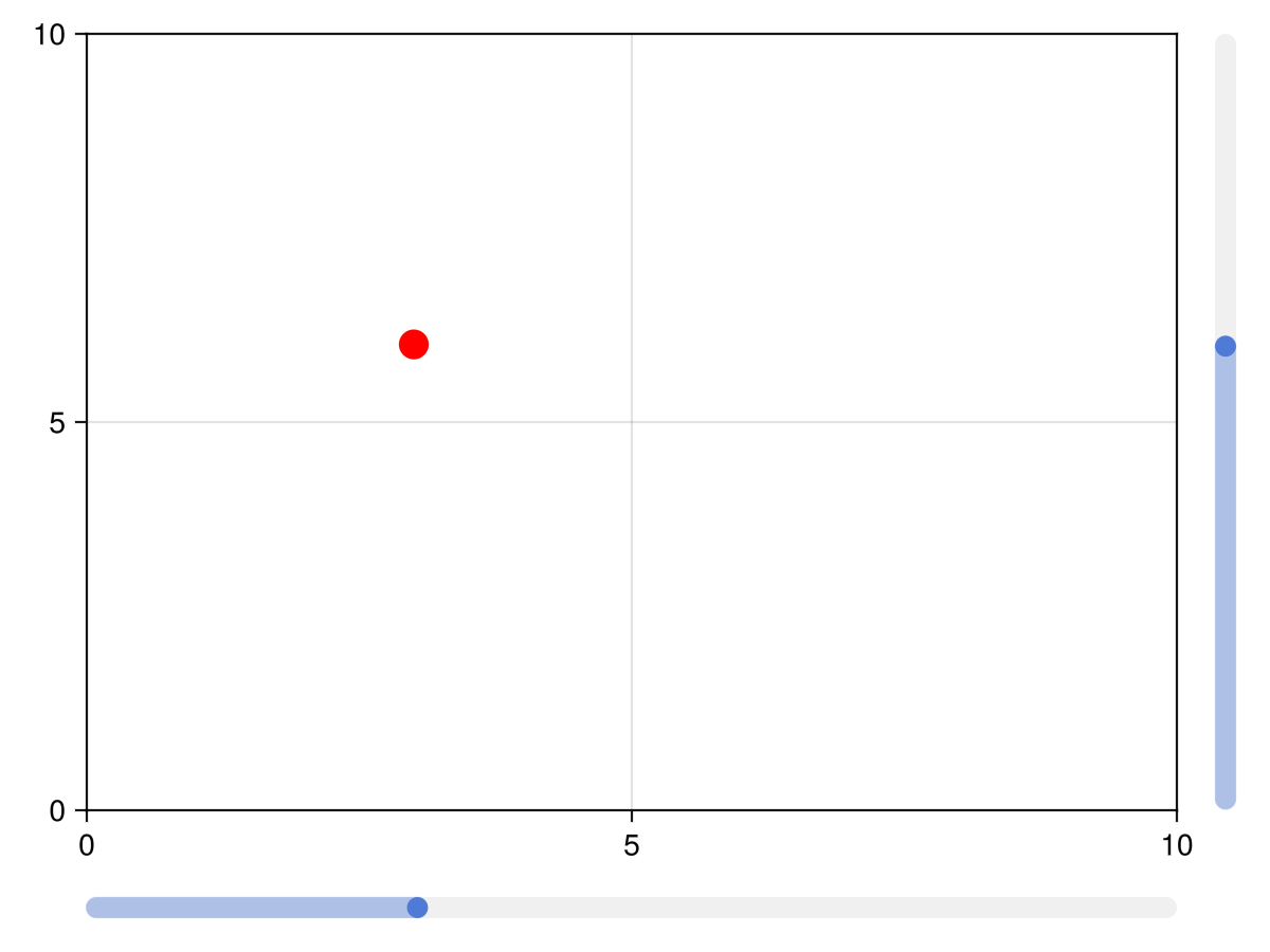
Labelled sliders and grids
The functions labelslider! and labelslidergrid! are deprecated, use SliderGrid instead.
Attributes
alignmode
Defaults to Inside()
The align mode of the slider in its parent GridLayout.
color_active
Defaults to COLOR_ACCENT[]
The color of the slider when the mouse clicks and drags the slider.
color_active_dimmed
Defaults to COLOR_ACCENT_DIMMED[]
The color of the slider when the mouse hovers over it.
color_inactive
Defaults to RGBf(0.94, 0.94, 0.94)
The color of the slider when it is not interacted with.
halign
Defaults to :center
The horizontal alignment of the element in its suggested bounding box.
height
Defaults to Auto()
The height setting of the element.
horizontal
Defaults to true
Controls if the slider has a horizontal orientation or not.
linewidth
Defaults to 10
The width of the slider line
range
Defaults to 0:0.01:10
The range of values that the slider can pick from.
snap
Defaults to true
Controls if the button snaps to valid positions or moves freely
startvalue
Defaults to automatic
The start value of the slider or the value that is closest in the slider range.
tellheight
Defaults to true
Controls if the parent layout can adjust to this element's height
tellwidth
Defaults to true
Controls if the parent layout can adjust to this element's width
update_while_dragging
Defaults to true
If false, slider only updates value once dragging stops
valign
Defaults to :center
The vertical alignment of the element in its suggested bounding box.
value
Defaults to 0
The current value of the slider. Don't set this manually, use the function set_close_to!.
width
Defaults to Auto()
The width setting of the element.